

Rooted in Culture
At its core, Khao Hom is about heritage—flavors passed down through generations, anchored in Thai culture.
The brand identity draws from traditional Thai symbolism, reinterpreted into a bold, contemporary mark. The flame and bowl motif becomes a central visual language, representing warmth, craft, and authenticity.
Rather than leaning into clichés, the approach was to distill cultural elements into something refined, modern, and memorable.
Designing the Experience
BRAND TO SPACE
The restaurant was envisioned as more than a place to dine—it is an environment that tells a story.
From the storefront to the interior layout, every element was designed to create visual continuity. Gold accents, graphic panels, and illuminated features guide the customer journey, creating focal points that draw attention while reinforcing brand identity.
The integration of environmental graphics—such as the elephant imagery and Thai-inspired patterns—adds depth without overwhelming the space.


A System Across Touchpoints
Beyond the physical space, the brand extends into menus, packaging, uniforms, and printed materials.
Each touchpoint follows a unified visual system—dark textured backgrounds, gold typography, and structured layouts—ensuring consistency across customer interactions.
Consistency in Every Detail
CONSISTENCY MORPHS INTO SYSTEM
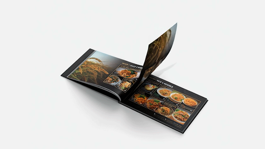
The menu design, in particular, balances rich food imagery with clear hierarchy, making it both appetizing and easy to navigate.

Modern Thai, Made Scalable
This project was not just about a single location—it was about creating a brand system that can grow.
By establishing clear visual rules and adaptable design elements, Khao Hom is positioned to expand across multiple outlets while maintaining a consistent identity.
The result is a brand that feels rooted in tradition, yet built for modern retail—distinctive, flexible, and ready to scale.


©2017 - 2026
Privacy policy